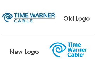
In March 2009, Time Warner Cable became its own, independent company. Since 1990, the eye and ear symbol used in the Time Warner brand identity has been an important element. In fact, in 1993, it began being used exclusively for Time Warner’s cable brand — Time Warner Cable. Throughout 2010, there have been rumors around the branding world that Time Warner Cable might do something drastic with its logo, possibly ditching the eye and ear entirely. Turns out there was no need for speculation at all, because the new identity released recently — complete with the logo, color palette, and eye and ear symbol — doesn’t veer very far from the previous version. You can check out the old and new logos below.

Time Warner Cable worked with The Brand Union for about a year on the new brand identity project. The new logo features a brighter and lighter blue, a heavier sans serif font that integrates “Cable” into the name rather than making it stand out, and uses a lighter, airier version of the eye and ear symbol. These are fairly subtle changes that don’t make a big difference to consumers but do help retain consumer perceptions of the Time Warner brand and provide a sense of security and longevity.
According to Time Warner Cable and The Brand Union, the eye and ear symbol is now at the center of the brand’s new visual system. Rather than a rebranding, the new logo and other identity elements are being called a brand identity refresh based on standards of simplicity, including minimizing sub-brands. In fact, the goal of the brand refresh, “was to convey simplicity and ease, removing any obstacles from doing what you love. Moving people forward to bring them back to having more time for what they love.”
What do you think of the Time Warner Cable brand identity refresh? Good, bad, indifferent? Leave a comment and share your thoughts.


 In November 2009, Oprah Winfrey announced that after 25 years she would be leaving the Oprah Winfrey Show behind on September 9, 2011. At the time, I wrote a blog post wondering who