Have you ever stood in the soup aisle at the grocery store and been faced with a sea of red Campbell’s soup cans, but you simply cannot find the flavor you’re looking for? We’ve all been there, cursing to no one in particular but desperately wanting to find that can of tomato soup so you can get out of there as fast as possible. Fortunately, Campbell’s heard our cries.
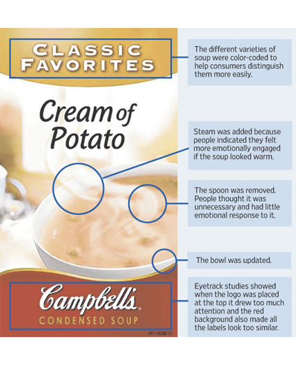
Using neuromarketing research results, Campbell’s has redesigned its soup can packaging from the top down. No longer is the red Campbell’s logo emblazoned across the top of Campbell’s soup cans. The neuromarketing research determined that having the red band of color along the top of all Campbell’s soup cans made it more difficult for consumers to find the specific flavors they wanted. Consumers became frustrated with the too consistent packaging of Campbell’s soups, so the logo has been relegated to the bottom of the can.
Based on the company’s research, the iconic Campbell’s soup can that’s been the subject of everything from Andy Warhol’s artistic eye to comedic skits has been replaced. Not only has the Campbell’s logo been moved, but the soups in the Campbell’s product line have been categorized and color-coded to save you a few minutes (or more) on your next trip down the grocery store soup aisle.
Check out some of the additional changes to the Campbell’s soup packaging shown in the image below:

What do you think of the new Campbell’s soup packaging? I don’t think repositioning the logo will affect the brand identity negatively, and I think the new packaging does look more modern. I also think the color-coding is a big improvement and will surely save me some time in the supermarket, but I don’t think I would have ever noticed the additional steam or lack of a spoon in the picture. How about you?
Image: Campbell’s via LogoLounge
Susan Gunelius is the author of 10 marketing, social media, branding, copywriting, and technology books, and she is President & CEO of KeySplash Creative, Inc., a marketing communications company. She also owns Women on Business, an award-wining blog for business women. She is a featured columnist for Entrepreneur.com and Forbes.com, and her marketing-related articles have appeared on websites such as MSNBC.com, BusinessWeek.com, TodayShow.com, and more.
She has over 20 years of experience in the marketing field having spent the first decade of her career directing marketing programs for some of the largest companies in the world, including divisions of AT&T and HSBC. Today, her clients include large and small companies around the world and household brands like Citigroup, Cox Communications, Intuit, and more. Susan is frequently interviewed about marketing and branding by television, radio, print, and online media organizations, and she speaks about these topics at events around the world. You can connect with her on Twitter, Facebook, LinkedIn, or Google+.
Weird. I thought they made this repackaging change ages ago, and I thought that many consumers (myself included) found the new packaging ridiculously difficult to locate flavours with. At least the old way, the font was big, bold, and clear.
But apparently I was just imagining things…