Wouldn’t it be nice if you could see at a glance how your strategy explanation is going to come across?
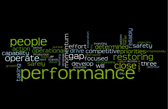
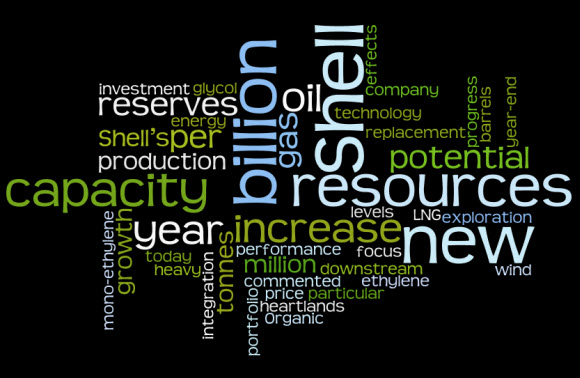
Wordle is a clever tool which displays words from a piece of text in different sizes depending on their frequency in an image. Just for fun, I’ve run the text that summarises the strategies of BP and Shell on their respective websites through this tool, and come up with the following images …


Although they are quite attractive images in their own right, this does let us see quite clearly the differences between the two.
The most important words in the Shell image are:
Shell, new, billion, resources, capacity, increase, year
The most important in the BP image are:
performance, people, operate, restoring, close, gap
Without even needing to read the text, we can see that there is a difference in focus between these two companies. For Shell, it is all about increases in capacity; for BP it is all about people and performance.
Note that although the biggest single word for Shell is ‘Shell’, and for BP, their name is one of the smallest words in the image, this is probably due to the way that they have phrased their text. I stripped out people’s names, but not the names of the companies. And I’m not claiming that this is a piece of detailed analytic work – but I do think that it reveals what the main messages of your text are, based on the words used.
If you ran your strategy statement through the same tool, what would the main focus look like? And is it what you intended?
Lucy is Editor at Corporate Eye
Great observation, Lucy. I’ve been pondering the analytical ramifications of Wordle as well. I see no reason to doubt its ability to spot what words we use the most – and thus determine the focus of our writing. Maybe not definitive, but it certainly can be one of a stable of analytical tools.
Thanks Robert – are there other tools you would recommend?
This was a very powerful demonstration. It really reflects the potential of Wordle. Your article has piqued my interest. Thanks for the great information.