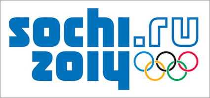
 The Sochi 2014 Winter Olympics logo was released this month, and at first glance, it seems to leave a lot to be desired. In fact, one could argue that it’s very boring. However, when you take a closer look, it’s actually quite innovative and the first of its kind for the Olympic Games.
The Sochi 2014 logo was created by the Moscow office of Interbrand and is the first Olympics logo to NOT focus on the city where the games are being held. Instead, the Sochi 2014 is the first Olympics logo to include a URL. But that’s not all. This online destination will have a social aspect to it. According to the brand identity explanation on the Sochi 2014 Web site,
“The ‘.ru’ component is Russia’s web-domain address and signifies that Sochi 2014 is an Olympic Winter Games hosted by a whole nation, as well as the Black Sea sub-tropical city of Sochi. The introduction of a 21st Century emblem for a digital generation reflects how the 2014 Olympic Winter Games will be accessed through PC screens, PDAs, mobile phones, televisions and other devices, in line with ever-improving internet reach, increased bandwidth and the adoption of new technologies. This can help young people to experience sport for the first time, with a view to active participation and long-term engagement with sport and Olympism.”
Furthermore, the mirror effect between ‘Sochi’ and ‘2014’ is intended to represent the physical location of the Games as the “meeting point between the [Black] sea and the mountains.”
Overall, I think the logo will be easy to apply to a variety of mediums, as proven in the Sochi 2014 Flickr photostream. I suppose it’s not surprising that a URL would become more important in terms of marketing the Olympic Games and generating revenue from them (which has proven to be more challenging in recent years than it was decades ago). However, I do miss the hosting city representation in the logo. I can get over that loss though. If the Web site does prove to be interesting, interactive, and social, it could be a great way to enhance the integrated experience of the Games.
I do have one complaint about the logo. Is the URL Sochi.ru or Sochi2014.ru? The URL is advertised within text on the Web site as Sochi2014.ru, but it appears to be Sochi.ru in the logo. After a bit of investigating, I learned that the URL is actually Sochi2014.ru. I tried both URLs and each leads visitors to the same Web site though. I don’t think the confusion will hinder the effort, but it does add an element of confusion, and no brand likes confusion!
What do you think of the new Sochi 2014 logo?
Susan Gunelius is the author of 10 marketing, social media, branding, copywriting, and technology books, and she is President & CEO of KeySplash Creative, Inc., a marketing communications company. She also owns Women on Business, an award-wining blog for business women. She is a featured columnist for Entrepreneur.com and Forbes.com, and her marketing-related articles have appeared on websites such as MSNBC.com, BusinessWeek.com, TodayShow.com, and more.
She has over 20 years of experience in the marketing field having spent the first decade of her career directing marketing programs for some of the largest companies in the world, including divisions of AT&T and HSBC. Today, her clients include large and small companies around the world and household brands like Citigroup, Cox Communications, Intuit, and more. Susan is frequently interviewed about marketing and branding by television, radio, print, and online media organizations, and she speaks about these topics at events around the world. You can connect with her on Twitter, Facebook, LinkedIn, or Google+.


It is boring. I don’t know why adding “dot something” gets called “innovative”. Atlanta 1996 had a website. Just because it has never been done for an Olympics, doesn’t mean it hasn’t been done hundreds of times before. And the Olympics will be happening in Sochi in 2014, not on the Internet. Unless now athletes can just e-mail in their triple axels or win by adding the most friends on Facebook?