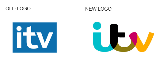
ITV is trying to find its positioning in the U.K. television market, and a new logo is the first visual element of its recent rebranding effort. In an effort to get away from the conservative logo that has been used since 2006, ITV launched a new colorful logo in a cursive typeface that the company hopes will make the brand seem friendlier. You can see the old and new logos below.

The rebranding will affect all of ITV’s properties and will give each its own “big channel idea” as Andrew Laughlin of Digital Spy reports. For example, ITV2 will become the “home of infectious entertainment” and ITV3 will be the “keeper of ITV’s treasured and timeless drama.” ITV4 will become the “home of sport and cult classics” or “the man club.” CITV will get its own version of the new logo which will be, “yellowy-orange with playful idents that burp and fart and do other things kids love.”
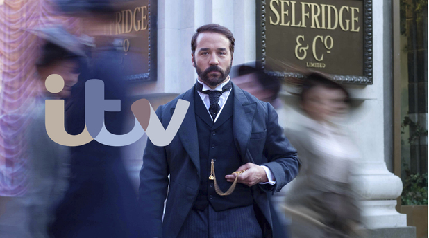
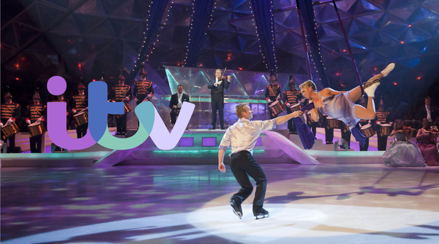
You can see some of the applications of the new logo design below.


The strategy behind the rebranding was explained in a press release that accompanied the logo launch last week:
“In an ever more crowed market place, both domestically and internationally, the need for a modern, flexible brand identity that connects with our viewers and customers has never been more important. We are really excited to soon be unveiling a new identity that is as up-to-date, and relevant as our content. Big, bold and creatively ambitious, it will be true to our DNA as a brand at the heart of popular culture.”
The new logo forms the basis of all ITV’s branding domestically and internationally, and is a warm, bold design based on a formalised version of human handwriting, comprising of five colours, in its static state.
When the logo appears on coloured background, such as marketing images for ITV programmes – it will adapt and change according to the background colour scheme of the image. This colour picking technique means that the logo can be dynamic, shifting tone along with the content, reflecting and blending with the mood of different shows.
Within the ITV broadcast business, the family of UK channels will all have a new on-air look, with ITV2, ITV3, ITV4, and CiTV receiving new colour schemes, clearer brand propositions, and accompanying updated brand identities.
To strengthen affinity between the overall brand, and the network’s flagship channel – ITV1 from January 2013 will be known as simply, ITV.
Constituent sub brands within the ITV main channel will also receive new on-air brand identities and colour schemes, such as ITV News and ITV Sport; and the ITV Player and online estate will also be rebranded.
Overall, this rebranding effort seems to be a positive change. Entertainment brands, particularly television networks, have been moving toward this type of fluid and flexible logo design in recent years, and the ITV rebranding should help to position it against its closest competitors.
What do you think? Leave a comment and share your thoughts on the ITV rebranding and new logo design.
Susan Gunelius is the author of 10 marketing, social media, branding, copywriting, and technology books, and she is President & CEO of KeySplash Creative, Inc., a marketing communications company. She also owns Women on Business, an award-wining blog for business women. She is a featured columnist for Entrepreneur.com and Forbes.com, and her marketing-related articles have appeared on websites such as MSNBC.com, BusinessWeek.com, TodayShow.com, and more.
She has over 20 years of experience in the marketing field having spent the first decade of her career directing marketing programs for some of the largest companies in the world, including divisions of AT&T and HSBC. Today, her clients include large and small companies around the world and household brands like Citigroup, Cox Communications, Intuit, and more. Susan is frequently interviewed about marketing and branding by television, radio, print, and online media organizations, and she speaks about these topics at events around the world. You can connect with her on Twitter, Facebook, LinkedIn, or Google+.
