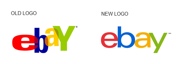
Whether or not you’ve ever bought or sold anything through eBay, it’s a brand name that the vast majority of people are aware of. The company’s virtual doors opened in 1995, and its logo remained the same until now. Ebay has launched a new logo (shown below) that will roll out in the fall.

Devin Wenig of eBay explains, “Our refreshed logo is rooted in our proud history and reflects a dynamic future. It’s eBay today: a global online marketplace that offers a cleaner, more contemporary and consistent experience, with innovation that makes buying and selling easier and more enjoyable. We retained core elements of our logo, including our iconic color palette. Our vibrant eBay colors and touching letters represent our connected and diverse eBay community — more than 100 million active users and 25 million sellers globally and growing.”
News of the eBay rebranding definitely got my ears perked up. This is a brand that needed a logo overhaul, and it’s a brand that could really think outside the box in its identity creative design.
With Lippincott signed on to create the new eBay brand identity, I couldn’t wait to check out the new logo when it launched. Unfortunately, my excitement ended there. The new logo is a perfect example of playing it safe and avoiding risk at all costs. This happens far too often in brand identity work for large companies where too many cooks spoil the broth and employees worry about job security rather than what’s best for the brand in the long term. Instead of speaking up and pushing the brand in innovative directions, the brand languishes in “safe” territory.
There is nothing wrong with the new eBay logo, it’s just disappointing and reflects a missed opportunity for the company. It looks nice in the conceptual mock-ups of ads and on the Web, but it lacks the “wow” factor many in the branding industry had hoped for.
The lesson to learn is this — don’t play it safe. Extreme risk-aversion means your brand will be mediocre at best.
Susan Gunelius is the author of 10 marketing, social media, branding, copywriting, and technology books, and she is President & CEO of KeySplash Creative, Inc., a marketing communications company. She also owns Women on Business, an award-wining blog for business women. She is a featured columnist for Entrepreneur.com and Forbes.com, and her marketing-related articles have appeared on websites such as MSNBC.com, BusinessWeek.com, TodayShow.com, and more.
She has over 20 years of experience in the marketing field having spent the first decade of her career directing marketing programs for some of the largest companies in the world, including divisions of AT&T and HSBC. Today, her clients include large and small companies around the world and household brands like Citigroup, Cox Communications, Intuit, and more. Susan is frequently interviewed about marketing and branding by television, radio, print, and online media organizations, and she speaks about these topics at events around the world. You can connect with her on Twitter, Facebook, LinkedIn, or Google+.
Oh dear, you’ve put it mildly, this is a step backwards in terms of saliency, and, beyond the marketing and strategy, which can not justify such an output, in terms of simple design. It’s truly awful and a waste of resources.
It will go down in history as one of the worst re branding (or rather, new logo design) exercise ever. Pathetic.