I invited Jordan Mendys to write a post for us today. His photos are lovely (do go and look at them) and I thought he’d have some interesting views about the visual aspects of the corporate website.
His point about intentionality, detail and tone is an extremely important one, whether you are considering your first corporate website or maintaining the latest iteration of a long-standing web position.
Visualizing Your Corporate Website
When it comes to web design, there is literally an unlimited possibility for what you can do. Of course, depending on what you are looking to do, there are directions you should steer clear of… Visual design for websites is very important. You want it to reflect the tone of your company and the business you do. Just as individual bloggers pay close attention to what is on their site, so should a corporate website. Every decision you make, from colors used, font of the text, and of course the layout all play a role in creating a tone for your business, and every role is just as important as the next. If you want to have a good, clean, and effective website, then you must take each of these into close consideration.
Layout
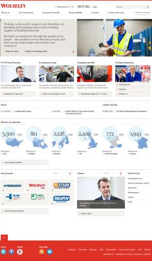
 This is the basic starting point for your site. You want to know how to organize your information for effective reception of your audience, as well as make it look professional. Typically, a corporate website should have some symmetry and solid form. Symmetric webpages show order and professionalism, whereas asymmetric websites are typically more whimsical and art driven. That’s not to say it doesn’t work for businesses, but make sure it fits your company and what you provide. For instance, Wolseley gets to the point by heavy use of symmetry, even their links to deeper pages. The deeper pages have the same layout. As you see, all the information on the site is well organized and planned out, making the user’s experience (UX) very easy.
As mentioned, your site doesn’t have to follow that same layout, but you have to clearly define your goals before you start to build a site. Are you there to entertain visitors to your site? Then a non-traditional, artsy, unbalanced site might be visually appealing enough for them to come and stay on your site. However if your goal is to give information to your potential customers and clients, you want access to your information simply laid out in a good order.
Color
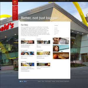
 Color is sometimes overlooked, but plays a big role is UX. There has been a ton of research into colors and their effect on mood. Reds and yellows create anxiety and a need to move quickly. This is why so many fast food restaurants use those colors; they want customers in and out quickly so more can come in. Yet, look at McDonald’s website, and while you’ll see bits of their famous color scheme, a lot of the pages and images used are not that color. That is because while they want you in and out of their restaurant quickly, they want you to spend as much time on their site as you can.
Using comforting colors like blues, browns, and others will make people want to stay on your site. Of course you’ll want to use your company’s colors for brand identity, but if those are comforting colors, they might should not play a major role in your design. In other instances, look at your industry. Are you a company with a “green” product? Well, that color might resonate with your audience. Or maybe an aqua color reminding them of the ocean, a big role that green technology plays. Whatever the case is, do some research on color, and make sure it fits your overall mood. The aforementioned ‘anxious’ colors can even work if your site and product is centered around adventure and an adrenaline rush. Just make sure the colors you pick are intentional and in line with your goals.
Font and Text
This one is pretty basic, but nonetheless should be paid some love. Font is often overlooked in regards to web design. A lot of times, people will want to look into flashy and neat looking fonts. You see this a lot of times on blogs, but when it comes to a corporate website, keep it simple. There is no need to use flashy fonts or text. Not only is it not necessary (good content is), but you also run the risk of looking unprofessional or detracting from your message. Just look to use to trusty fonts. Pretend you’re writing a business email or memo. Would you want to use Comic Sans or Wingdings? Most likely not, so keep the same professional mentality on your website. It is not a hard task, but certainly one you will want to pay attention to.
So these are the basics to getting your corporate website up and running. Make sure that you have a clear goal that you want to achieve with your website, then execute those tasks accordingly. Every little thing that goes on your site is important, as every little detail will be scrutinized. Pick colors, fonts, and even pictures with complete intention, and don’t let anything fall through the cracks. You want visitors to come to your site and stay there, so make sure is a welcome environment once they make their way over.
Jordan Mendys is a media professional and blogger. He is also a freelance photographer and filmmaker who lives in North Carolina with his wife. Jordan is also a content creator and writer for Digital Satellite Dish TV.
Lucy is Editor at Corporate Eye

Hi, thanks for the post. I run the design team at The Group, we’re based in London (UK), and we worked closely with Wolseley to design and build the site you mentioned. We’re very pleased you like it and found it easy to use.
Our starting point with the site design for Wolseley – as with any new client – was with deep analysis. Before we made any design decisions we had to get to know the business, the sector, the brand, and study as many branded executions online and offline as we could. Then deconstruct it all, decide what worked, what didn’t, and reassemble to make a new online identity.
Layouts were managed by creating a solid underlying gird system. Making a grid is a bit like defining the foundations of a house, a grid helps us to keep pages aligned consistently across the site, but if well thought out also gives us room to create interesting layouts. Most corporate sites we see have an underlying grid, some better than others.
With colour we worked within the brand, no reason to re-think it, red is the core colour for Wolseley. Nothing really wrong with using red online, it’s more about how you apply it. Using red sparingly and strategically to aid navigation was the aim. Definitely no red text!
On typography I kind of agree when you say keep it simple. For us designers of corporate sites it’s not about self expression, it’s about conveying messages – we use typography to communicate and also complement brand identities. We often find that corporate sites don’t pay enough attention to type hierarchy. Sometimes it’s nice to see a big clear piece of type that speaks confidently and clearly, but also with the bulk of corporate site pages being content heavy, time spent on a legible text page can have a big impact.
We launched the new Wolseley.com early this year. For more information on the job take a look at our post. http://www.the-group.net/blog/index.asp?blogid=521
Hi John
Thanks for taking the time to comment so fully on Jordan’s post – and for the link to Rebecca’s post.
I like the metaphor of the grid as the foundations of a house. I wonder how far we can push that? Stakeholder areas as floors in a house or wings of an exhibition hall, perhaps (never a museum!); content blocks as rooms to display the content; social media widgets as … windows, or doors to events/conferences?
And I so agree on legibility and communication. I find some web pages hard to read: not just physically difficult (could be because of small text, poor font choice or low contrast) but sometimes because of a lack of clarity in the content itself, and it can be very frustrating. Even such small things can affect the take-away impression of the brand.
Thanks Lucy, no problem. The house metaphor could run forever, like it! We sometimes talk in car metaphors as well – the dashboard, steering wheel and pedals being the site navigation – but I’ll not go there.
Yes, we also find that lack of clarity in messaging is quite common. Often businesses have great stories to tell the world, but they are buried deep in a site within a long page of small copy. I’ve always thought that many small things can do serious damage, a kind of cumulative effect that tarnishes the experience and the brand. Like a nice car with lots of small dents and scratches (sorry).