 Logo design is a tricky business. Developing a visual mark that represents a brand promise in a way that consumers will accurately perceive today and in the future is very challenging. As your business grows and your brand extends to new markets, new channels, and new products, it will have to “work” in all of those extensions.
This is a task that Disney performs very well as you can see in the recent launch of its new logo for the Disney Channel. The Disney Channel is available in countries around the world, so the new logo had to be consistent with the overall Disney brand and effectively communicate the Disney experience as well as work for a global audience.
Fortunately for the Walt Disney Company, it has an iconic logo to start with. Or is that unfortunately?
The truth is that tweaking an iconic logo for brand extensions is most often harder than tweaking an unknown or less-beloved symbol. The problem for Disney isn’t creating a great logo. It has Walt Disney’s handwritten signature to start from. That logo is the heart and soul of the brand promise because it represents Walt Disney’s original dream. For die-hard Disney fans, tweaking the logo is a betrayal against the Disney promise they believe in.
So how do you tweak and extend an iconic logo the Disney way?
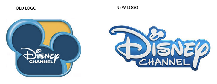
Take a look at the old and new logos for the Disney Channel that are shown in the image at the beginning of this article. The heart and soul of the brand is still very evident in the new logo. In fact, the heart and soul of the brand promise is more evident in the new logo than it was in the old logo. Yes, Mickey Mouse’s ears have been shrunk down to the dot of an i, but they’re still there—alongside of Walt’s signature. Take a look at the commercial bumper below that started airing on the Disney Channel this month. The Mickey Mouse ears still play a prominent role in representing the brand in a way that consumers know, understand, and expect.
In a press release from Disney, Ron Pomerantz, vice president of marketing and creative for the Disney Channel, explained, “Our viewers have great affinity for two heritage elements that have long created a ‘story’ during our daily programming schedule — the four note music mnemonic and the beloved ‘wand ID’ in which our stars form our Disney Mouse ears with a wand. We are looking forward to introducing these elements in an exciting new package.”
Whether or not you’re a Disney fan, there is no doubt that you can learn a lot about building a brand through consistency in brand communications, visuals, and experiences. It’s that consistency that enables Disney to retain a positive brand image and reputation among its many extremely loyal customers around the world.
What do you think of the new Disney Channel logo? Share your thoughts in the comments below.
Susan Gunelius is the author of 10 marketing, social media, branding, copywriting, and technology books, and she is President & CEO of KeySplash Creative, Inc., a marketing communications company. She also owns Women on Business, an award-wining blog for business women. She is a featured columnist for Entrepreneur.com and Forbes.com, and her marketing-related articles have appeared on websites such as MSNBC.com, BusinessWeek.com, TodayShow.com, and more.
She has over 20 years of experience in the marketing field having spent the first decade of her career directing marketing programs for some of the largest companies in the world, including divisions of AT&T and HSBC. Today, her clients include large and small companies around the world and household brands like Citigroup, Cox Communications, Intuit, and more. Susan is frequently interviewed about marketing and branding by television, radio, print, and online media organizations, and she speaks about these topics at events around the world. You can connect with her on Twitter, Facebook, LinkedIn, or Google+.
