Earlier this year, I wrote a post about the history of the Apple logo. Today, I want to talk about the IBM logo – an iconic, well-recognized tangible symbol of the IBM brand that has gotten better with each redesign but might need another.
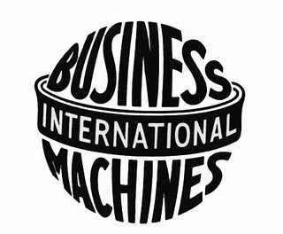
Logo 1: International Business Machines
1924 – 1946

According to the IBM Archives, the origins of IBM started in 1924 when the former Computing-Tabulating-Recording-Company took on a new name — International Business Machines Corporation. The new logo design is described in the IBM Archives as follows:
“The ornate, rococo letters that formed the “CTR” logo were replaced by the words “Business Machines” in more contemporary sans-serif type, and in a form intended to suggest a globe, girdled by the word ‘International.'”
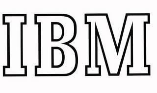
Logo #2: IBM in Transition
1947-1956

As IBM transitioned from a punched-card tabulating company to a computers business, a logo redesign was in order. However, the new logo was rolled out quietly. The new, simple IBM logo used a font called Beton Bold.
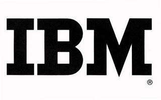
Logo #3: IBM Continuity
1956-1972

When IBM’s chief executive announced that he was stepping down and his son would takeover to lead the company, a new logo followed. However, to create the perception that the leadership change and other forthcoming changes to the IBM business would be subtle and maintain continuity, the new logo tried to follow that claim. The wordmark stayed basically the same aside from a typeface change to City Medium. As the IBM Archives explain,
“The letters “IBM” took on a more solid, grounded and balanced appearance.”
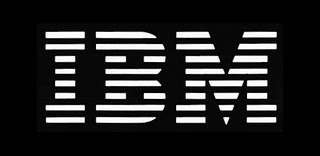
Logo #4: IBM International Recognition
1972-Today

In 1972, the IBM logo was redesigned again as the business went global. The IBM Archives explains,
“Horizontal stripes now replaced the solid letters to suggest “speed and dynamism.” In the intervening quarter-century, the basic design has remained constant, one of the most recognized logotypes in the world, and a design that has been widely imitated by others.”
The Future
It has been nearly 40 years since the IBM logo has been updated. While I agree that the logo is easily recognized and has great brand value, I think it’s time to bring this logo into the 21st Century.
What do you think would make a great new design for the IBM logo? Do you think it’s time for a redesign? Leave a comment and share your thoughts.
Images: IBM Archives
Lucy is Editor at Corporate Eye

If it ain’t broke, don’t fix it.
The current logo was designed by a master, Paul Rand (no, not Rand Paul).
The previous AT&T logo was created by yet another master (and Rand confrere), Saul Bass — and the recent redesign, IMHO, doesn’t come up to his armpits.
Just because years pass doesn’t mean the design isn’t as strong as ever. Viz, Coca-Cola, GE, Ford…
IBM’s logo is still great. They should keep it.
Yeah I think some logos just can stay the way they are, even though tweaking the IBM logo a tad might not hurt. It just works so well as is, it would be really difficult to try to recreate or redesign something so perfect.