 It’s hard to believe that five years ago YouTube didn’t exist and uploading and sharing personal videos online was actually challenging. On February 14, 2005, the YouTube.com domain was registered. Less than 2 years later, in October 2006, YouTube.com was sold to Google for $1.65 billion. Today, it’s the most trafficked online video site with over 100 million unique visitors watching over 7 billion videos each month (source). YouTube is a powerful global brand and is positioned as the market leader in the online video industry.
Now, that’s a brand success story!
It’s well known in branding theory that being first to market is an important element of strong brand positioning, but it’s not a guarantee of success. The founders of YouTube created the right site at the right time. They recognized an opportunity, and they capitalized on it. Fortunately for their wallets, the almighty Google also recognized the opportunity, and coughed up a lot of money to purchase YouTube in 2006. It’s interesting to wonder if YouTube would have grown to the massive size that it is today without Google behind it. However, it’s equally interesting to wonder what YouTube would have grown into without Google behind it.
Other competitors have come and gone, but YouTube still holds a massive market share advantage over those competitors. While YouTube has become the go-to site for personal videos and video sharing, many businesses and brands are also creating branded YouTube channels to leverage the growing interest in online video among consumers. The problem for online video viewers is finding the credible content amidst the clutter that has become one of the biggest criticisms of YouTube.
YouTube will remain the leader for some time, but it seems apparent that changes need to come to the site to separate the branded content from the content uploaded by teenagers lip synching to Hannah Montana. That’s the current opportunity for YouTube. The YouTube brand image has shifted to focus more on personal video sharing over the years, leaving a large market open for a competitor to snatch if YouTube allows it.
What do you think? Will YouTube look the same on its 10th birthday or will changes be made? Leave a comment and share your predictions.

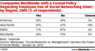 Gartner also predicts that companies will become more open to employees using both business and personal social networks for business purposes, but with that change in policy will come the need for companies to create specific guidelines for use. According to a study by Manpower (via
  The original Apple logo was created by one of the lesser-known founders of Apple Computer Co., Ronald Wayne. It’s hard to even notice the apple hanging from the tree above Sir Isaac Newton’s head in this image. The text that borders the image (which is too small to read at any size) reads, “Newton… A Mind Forever Voyaging Through Strange Seas of Thought … Alone.” It’s not surprising that this logo only lasted a year as the primary tangible symbol of the Apple brand. There is really nothing positive that you can say about it in terms of branding a technology company.
 The rainbow apple is the logo that most consumers saw in their introduction to the Apple brand. Apple brand champion Steve Jobs, himself, hired graphic designer Rob Janoff of the Regis McKenna Advertising Agency to design the new logo, and the final design chosen — the rainbow apple — worked. According to some reports, Janoff has claimed the bite taken out of the apple was intended to show people that the image was an apple, not a tomato, and it was a play on words between “bite” and the technical term “byte”.
 One year after Steve Jobs returned to the helm of Apple (after he was ousted from the company years earlier), he called for a logo update, and what came out of this redesign was a color change from the dated rainbow palette to a modern monochromatic version that was also highly web-friendly. The primary color for this Apple logo, which is still used today, is chrome, but it has appeared in other colors as well. In a word, the new logo was sleek and matched the new direction Jobs planned to take the company. The monochrome Apple logo has even been reported as stimulating the brain and making people who are exposed to it more creative (according to a
  Earlier this month, I wrote an article that was published on Entrepreneur.com where I listed