Successful brands evolve with the environment and with their audiences. That’s what consumers expect. A stagnant brand is likely to, well, stagnate. Of course, there are exceptions to every rule. In this case, Coca-Cola is that exception.
Yes, the Coca-Cola brand has evolved with new slogans and advertising. The company has even launched a variety of successful (and not so successful) brand extensions. However, the core Coca-Cola brand has changed little in the 126 years since it debuted in 1886. Take a look at the first Coca-Cola logo compared to the current Coca-Cola logo shown below.

These two logos are strikingly similar. Coca-Cola demonstrates that timeless brands do exist, and tangible elements of a brand identity can be timeless, too. Sometimes minor tweaks along the way are far more effective in ensuring a brand appeals to generation after generation of consumers than large-scale rebranding efforts are.
Where did the iconic and timeless Coca-Cola logo come from? The story is actually similar to many of the logos that stand the test of time (the Playboy logo is another great example). As explained in the Coca-Cola Heritage website, “Thinking that ‘the two Cs would look well in advertising,’ Dr. John Pemberton’s [the inventor of Coca-Cola] partner and bookkeeper, Frank M. Robinson, suggested the name and penned the now famous trademark “Coca-Cola” in his unique script.”
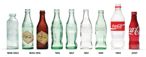
Even the Coca-Cola bottle, dubbed the “contour bottle” by the company, has remained extremely similar to the version developed in 1900. The materials changed, and the shape has been tweaked, but the basic, iconic design is still the same. Check out the evolution of the Coca-Cola bottle in the image below.

The history of the Coca-Cola bottle was described in the company’s 125th anniversary booklet as follows:
“Working with our bottlers, The Coca-Cola Company asked bottle manufacturers to submit designs for a bottle for Coca-Cola that was so distinctive that it could be recognized by feel in the dark or identified lying broken on the ground. Alexander Samuelson of the Root Glass Company in Terre Haute, Indiana, designed the distinctive shape, and it was patented on November 16, 1915. The bottle was modified and slimmed down to work with the current bottling equipment and went into broader production in 1916. This contour bottle was the only packaging used by The Coca?Cola Company for 40 years until the king-size package was introduced in 1955. In 1960, the contour bottle was granted registration as a trademark by the U.S. Patent Office. Today, it is still the most recognized bottle in the world.”
While other brands struggle to remain relevant by redesigning brand elements like logos and color palettes, Coca-Cola continues owning its space in the market through consistency, persistence, and restraint — the 3 core steps of brand building. Can your brand say the same?
Images: Coca-Cola
Susan Gunelius is the author of 10 marketing, social media, branding, copywriting, and technology books, and she is President & CEO of KeySplash Creative, Inc., a marketing communications company. She also owns Women on Business, an award-wining blog for business women. She is a featured columnist for Entrepreneur.com and Forbes.com, and her marketing-related articles have appeared on websites such as MSNBC.com, BusinessWeek.com, TodayShow.com, and more.
She has over 20 years of experience in the marketing field having spent the first decade of her career directing marketing programs for some of the largest companies in the world, including divisions of AT&T and HSBC. Today, her clients include large and small companies around the world and household brands like Citigroup, Cox Communications, Intuit, and more. Susan is frequently interviewed about marketing and branding by television, radio, print, and online media organizations, and she speaks about these topics at events around the world. You can connect with her on Twitter, Facebook, LinkedIn, or Google+.
