I recently received this tweet from Skellie, one of my favorite idea sources:
Productivity in 11 words: One thing at a time. Most important thing first. Start now.
So–I promptly threw out my entire library of David Allen and Stephen Covey books, closed my Nozbe account, and trashed my Pomodoro.
Not really. But I do recognize that if I followed the 11-word formula faithfully, I would resolve a lot of productivity problems. And happily, this thought fit right in with a post I’d been planning on how to avoid the social media time trap. Then I got a tweet about JobDeck, and everything fell into place!
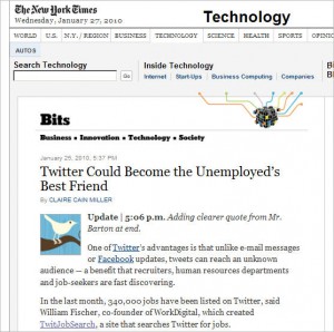
TweetDeck is just one of the several good tools available for managing Twitter, but it’s the one I know best. And it’s also the one that recently rolled out a special version for job-seekers. JobDeck is essentially TweetDeck enhanced with built-in job search functionality, a special column for recruiting news, and a desklike appearance. The New York Times Technology section offers a nice summary of the product.
In terms of productivity—having a dashboard like TweetDeck, where you can filter and organize many Twitter streams (as well as input from Facebook and LinkedIn), is a huge help if you really want to be involved in social media. But TweetDeck can also increase the seduction factor by making you aware of just how much is going on in the Twitterverse every minute. So you might want to browse Tim Ferriss’s article How to Use Twitter Without Twitter Owning You—5 Tips. One tip (“Set alerts or blocks on Twitter usage”) discusses productivity aids like RescueTime. I’m about to test-drive RescueTime and will review if it’s interesting.
I’m also trying out Mr.Tweet. Basically, Mr.Tweet looks at your own followers/followees and recommends other Twitterers you might want to consider. So far, Mr.Tweet has made some interesting suggestions—and the excellent interface shows how each one was derived, as well as providing individual profiles that include Twitter statistics and sample tweets. It’s free, and worth a look, especially if you have a focused Twitter agenda and would like to quickly find high-value tweeters.
A final thought about Twitter and productivity. I was a late adopter of Twitter, and I’m still figuring out how best to use it. One key (for me anyway) has been finding people whose tweets alert me to things I want to know about. Getting the most out of Twitter requires practice, but you can learn to scan various streams quickly and pick out just what’s relevant or intriguing, while letting the rest go by.
That’s from the perspective of using Twitter as an information source. Using Twitter as a search tool has a whole different set of considerations, and there is not a better overview than Boolean Blackbelt’s How to Search Twitter for Sourcing and Recruiting.
 The original Apple logo was created by one of the lesser-known founders of Apple Computer Co., Ronald Wayne. It’s hard to even notice the apple hanging from the tree above Sir Isaac Newton’s head in this image. The text that borders the image (which is too small to read at any size) reads, “Newton… A Mind Forever Voyaging Through Strange Seas of Thought … Alone.” It’s not surprising that this logo only lasted a year as the primary tangible symbol of the Apple brand. There is really nothing positive that you can say about it in terms of branding a technology company.
 The rainbow apple is the logo that most consumers saw in their introduction to the Apple brand. Apple brand champion Steve Jobs, himself, hired graphic designer Rob Janoff of the Regis McKenna Advertising Agency to design the new logo, and the final design chosen — the rainbow apple — worked. According to some reports, Janoff has claimed the bite taken out of the apple was intended to show people that the image was an apple, not a tomato, and it was a play on words between “bite” and the technical term “byte”.
 One year after Steve Jobs returned to the helm of Apple (after he was ousted from the company years earlier), he called for a logo update, and what came out of this redesign was a color change from the dated rainbow palette to a modern monochromatic version that was also highly web-friendly. The primary color for this Apple logo, which is still used today, is chrome, but it has appeared in other colors as well. In a word, the new logo was sleek and matched the new direction Jobs planned to take the company. The monochrome Apple logo has even been reported as stimulating the brain and making people who are exposed to it more creative (according to a
  I was interested to see that
 Earlier this month, I wrote an article that was published on Entrepreneur.com where I listed